frida kabo
brand strategy & identity | podcast cover Artwork
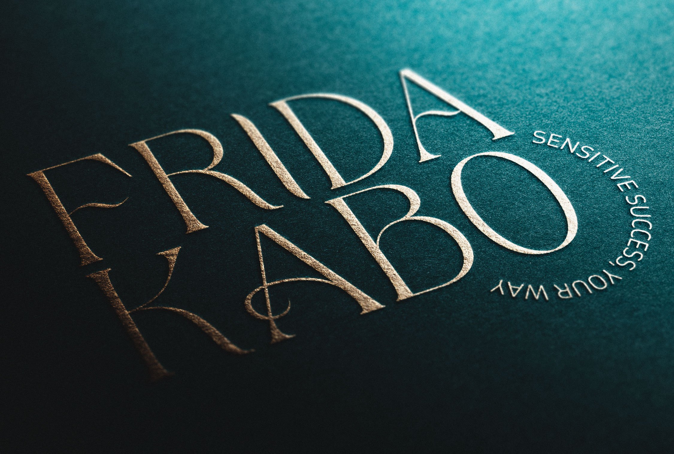
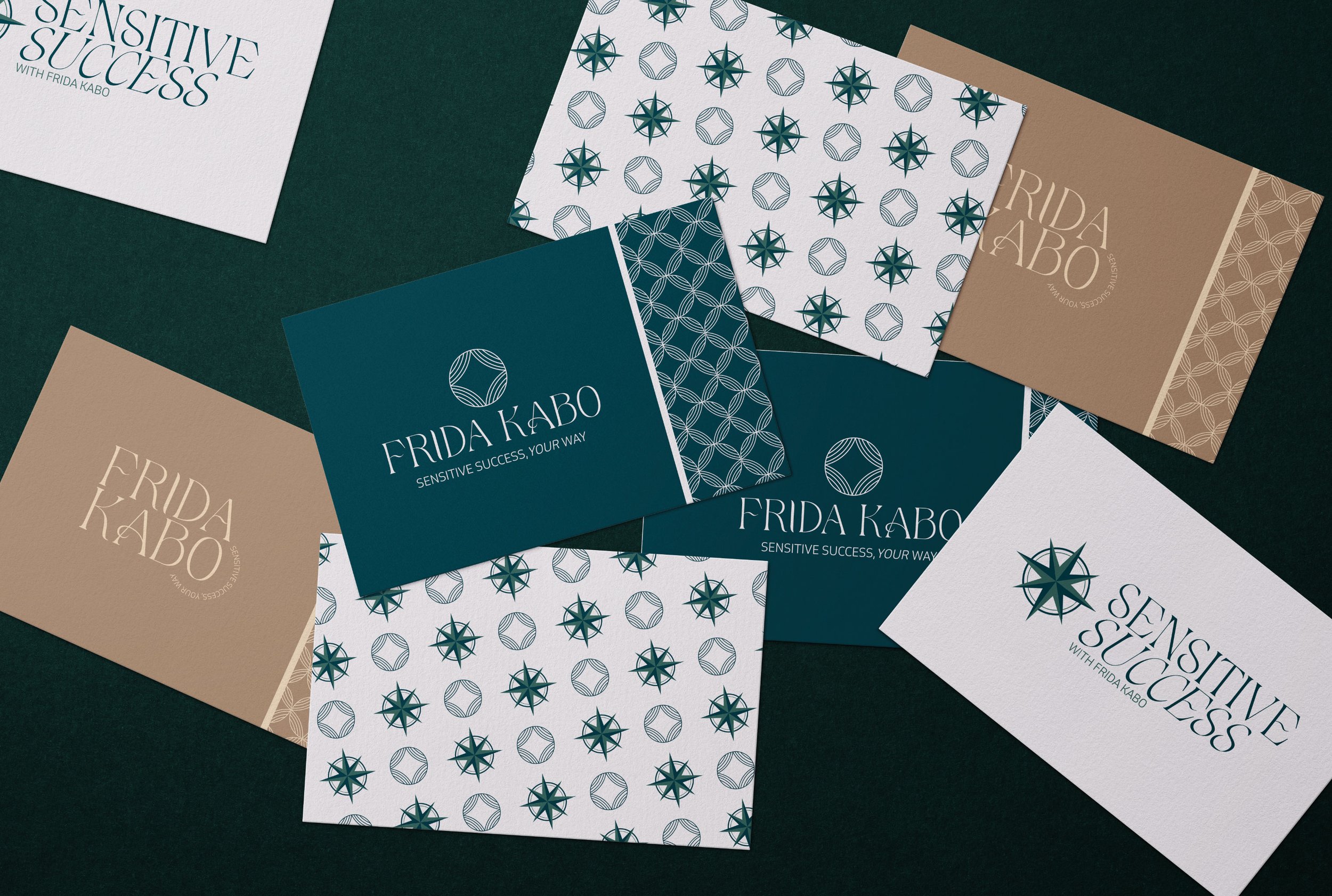
Frida Kabo came to me wanting to refresh her branding. She had an old Canva made logo, a colour palette, and a couple of mismatched brand elements that felt amateurish and outdated. So we started with a brand strategy workshop where we got clear on her goals and vision for the future of her business. Then we moved on to attracting her target audience and through a combination of strategy and aesthetics we created a gorgeous brand identity. A brand identity that simultaneously feels ground and magical (Frida’s exact goals)! The logo mark represents the layers of inner, unseen strength that sensitive people possess.
We also designed a sub brand called “Sensitive Success” that has it’s own logo and colours that are designed to fit perfectly within the Frida Kabo umbrella brand. Along side her brand identity, I also redesigned Frida’s podcast cover artwork and the graphics for her Online Summit.
Brand Identity
⋆
Brand Strategy
⋆
Podcast Cover Artwork
⋆
Brand Identity ⋆ Brand Strategy ⋆ Podcast Cover Artwork ⋆
“I love my new branding! It's on a whole new level, magical and grounded just like I wanted it. It's so easy to put together things now that I have everything set up. Bailey is great to work with and I highly recommend her if your looking to take your business look and feel to a new level.”
Frida Kabo - Founder of Sensitive Success
Ready to elevate your brand to new heights?
Take the first step towards a captivating and memorable brand identity. Enquire today about unleveling your branding and unleash your business’s full potential!


